

Hi there
I installed / upgraded to the new version 2.1.2.
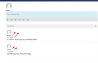
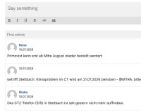
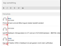
Now the formatting is incorrect: the username and the date are now below the avatar, and it flushes left. It doesn't look good and takes up too much vertical space (see screenshot). The demo pages still show the better old format.
Can you fix this? That would be great!
I installed / upgraded to the new version 2.1.2.
Now the formatting is incorrect: the username and the date are now below the avatar, and it flushes left. It doesn't look good and takes up too much vertical space (see screenshot). The demo pages still show the better old format.
Can you fix this? That would be great!